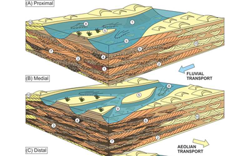
First impressions matter, especially when it comes to securing investment. In geoscience, complex data like seismic lines (as seen below) needs a clear translation to grab attention and showcase value, especially to a wide audience often with a non-technical background.
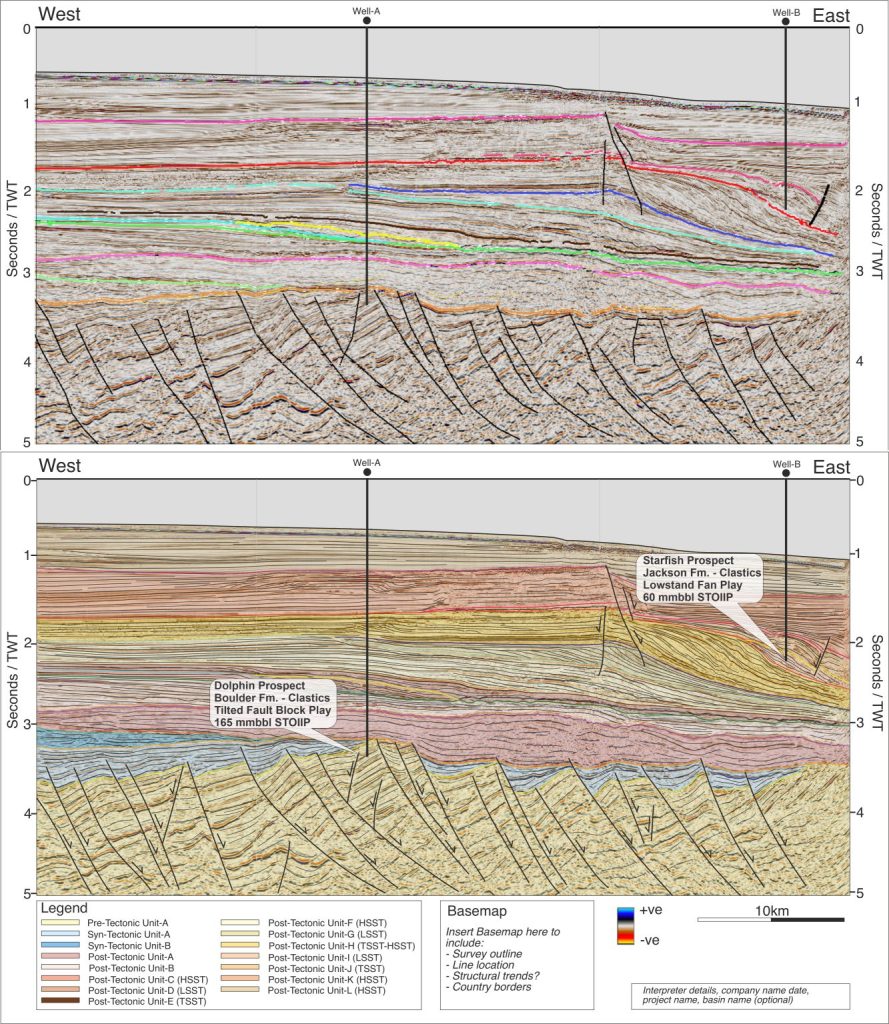
The image below showcases a typical seismic line on the left and a clear, drafted section by Define Geo on the right. Seismic lines with horizon interpretations tend to show raw data with rudimentary interpretation, while drafted sections often show more than this, the geologist’s interpretation.
Drafted sections like the one at the bottom (created with clear symbology and labeling) transform data into a compelling story for investors. Here’s why:
- Clarity builds trust: Vivid graphics demonstrate professionalism and a deep understanding of your project’s geology.
- Focus drives value: Clear visuals highlight key features and potential resources, making your investment proposition stand out.
- Engagement leads to action: Compelling visuals grab attention and make your pitch memorable, increasing the chance of securing investment.
Looking to showcase your subsurface project’s true potential?
Learn more about crafting impactful data visuals on our website.